Inspiration
2.0 Macross 4.0
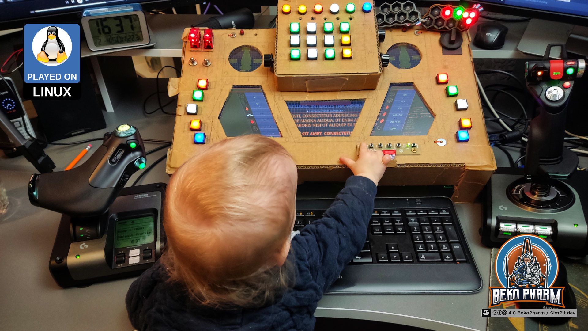
I was really happy with version 1 and yet, in the end I fell into the same trap as most of the Sci-Fi UI designers in PC games and movies do. All those “little” displays looked great, I had my hexagonal status indicators (nothing says Sci-Fi more like hexagons) but it was not easy to bring any meaningful content on the skewed “screen estate”. And skewed is a CSS literal here.
There was also the thing that I redesigned version 1 inside out so much by now, and moved it around a lot in the house, that it started to fall apart and had to be taped regularly. Yes, the phun of the Primary Buffer Panel falling off happened several times.


I eventually stumbled over a hand drawn design of a VF-1 Valkyrie cockpit of the Macross franchise while looking for inspiration for something with more “screen estate”.
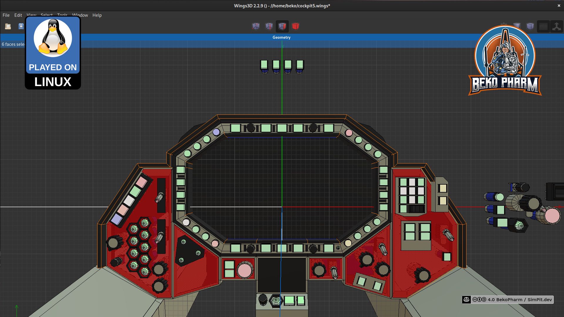
I created a 3D model of the upper cockpit panel in Wings3D where I started to shove around buttons and switches to my liking while keeping close to the original layout. This way I ended up with way more buttons (can never have enough) and get more “screen estate” out of the box while still maintaining a sane layout that would not be in the way of operating something with it later.
